Line Plots:
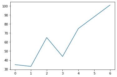
A line plot is typically used to plot the relationship between two numerical variables. Below is a code snippet for plotting the number of ice creams sold during a week.
import pandas as pd
import matplotlib.pyplot as plt

#number of ice creams sold during a week
ice_cream = [35,33,65,44,75,88,101]

plt.plot(ice_cream)

plt.show()
<link rel="stylesheet" href="https://pygments.org/css/">
import pandas as pd
import matplotlib.pyplot as plt

 #number of ice creams sold during a week
ice_cream = [35,33,65,44,75,88,101]
plt.plot(ice_cream)
plt.show()
A line plot, simply put, connects the data points with a straight line.
Pie Chart:
A pie chart is a circular figure that depicts the percentage or proportion of data. To create a pie chart, we can use the Matplotlib’s pie() function. The following code snippet shows the market share of browsers worldwide. The stats are taken from this website.
x = [64.73,18.43,3.37,3.36,10.11]
labels = ['Chrome', 'Safari', 'Edge', 'Firefox', 'Others']

plt.pie(x, labels=labels,autopct="%.1f%%")
plt.show()
<link rel="stylesheet" href="https://pygments.org/css/">
x = [64.73,18.43,3.37,3.36,10.11]
labels = ['Chrome', 'Safari', 'Edge', 'Firefox', 'Others']

plt.pie(x, labels=labels,autopct='%.1f%%')
plt.show()
The autopct argument in the function pie() is used to show the percentage values on the pie chart. If you want the slices to be separated, we can use the argument explode in the pie() function. To explode all the slices use the following setting.
plt.pie(x, labels=labels,autopct="%.1f%%",explode=[0.1]*5)
plt.show()
<link rel="stylesheet" href="https://pygments.org/css/">
plt.pie(x, labels=labels,autopct='%.1f%%',explode=[0.1]*5)
plt.show()
It’s worth noting that the length of the list provided to explode should be the same as the number of categories. If you need to highlight the market share of a particular company, say, Safari, we can use the following.
plt.pie(x, labels=labels,autopct="%.1f%%",explode=[0,0.3,0,0,0])
plt.show()
<link rel="stylesheet" href="https://pygments.org/css/">
plt.pie(x, labels=labels,autopct='%.1f%%',explode=[0,0.3,0,0,0])
plt.show()
Scatter Plot:
Another popular plot is scatter plot. It plots the relationship between two numeric features in a data set. Each data point will have a x and y coordinate and is represented by a dot. The following scatter plot shows the relationship between the experience and salary of people. The CSV file can be downloaded here.
import pandas as pd
import matplotlib.pyplot as plt

sal = pd.read_csv('/Salary_Data.csv')

experience = sal['YearsExperience']
salary = sal['Salary']

plt.scatter(experience, salary)
plt.show()
<link rel="stylesheet" href="https://pygments.org/css